August 20, 2026
Best Fonts & Typography Practices for Websites
Milaaj Editorial / Research Insights
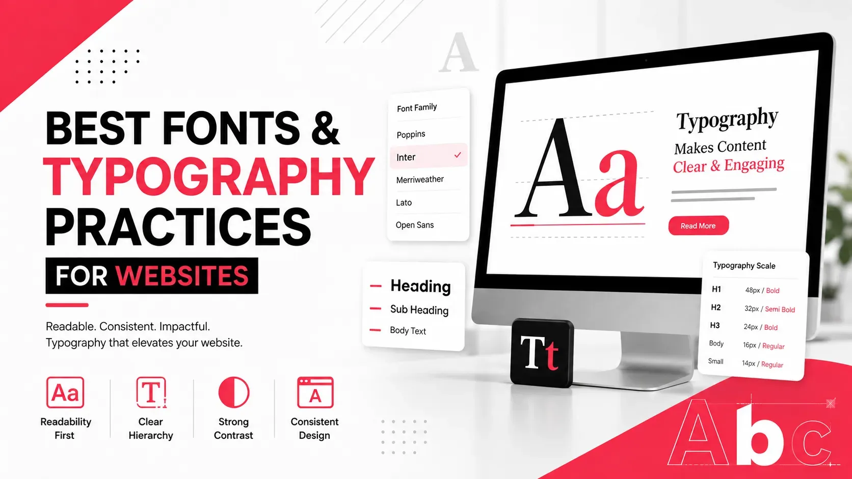
Typography is one of the most visible parts of a website, yet it is often treated as a finishing detail.
A business may spend significant time choosing colors, images, animations, and layouts while giving little attention to the fonts used throughout the site. But typography affects much more than appearance. It influences readability, visual hierarchy, accessibility, brand perception, and how easily visitors can find and understand information.
The right typography makes a website feel natural to use. The wrong combination can make even excellent content feel difficult to read.
For that reason, choosing website fonts should involve more than asking, “Which font looks good?”
The better question is:
“Which typography system helps visitors read, understand, and interact with this website?”
Quick Answer
The best typography practices for websites include:
- Choose fonts based on readability and brand personality
- Limit the number of font families
- Create a clear heading and body-text hierarchy
- Use appropriate font sizes and line heights
- Keep paragraphs easy to scan
- Test typography on mobile devices
- Use font weights consistently
- Optimize font loading for performance
- Consider accessibility when selecting typefaces
- Maintain consistent typography across pages
A good website typography system should look professional while making the content effortless to consume.
Why Typography Matters for Website Design
Typography influences how visitors experience a website before they consciously think about it.
A modern technology company might use a clean sans-serif typeface to communicate simplicity and innovation. A luxury brand might choose an elegant serif for a more editorial feel.
But aesthetics aren't the only consideration.
Typography also affects:
- Reading speed
- Content comprehension
- Navigation
- Visual hierarchy
- Brand recognition
- Mobile usability
- Accessibility
- Perceived professionalism
A page with excellent information can still perform poorly from a user-experience perspective if visitors struggle to read it.
This is why typography belongs in the design process from the beginning rather than being added after the layout is complete.
How to Choose the Right Font for a Website
There is no single "best" font for every website.
The right choice depends on the brand, audience, content type, and interface.
Consider three factors first:
Brand Personality
Ask what the typography should communicate.
A financial company may need a professional and trustworthy appearance, while a creative agency may have more freedom to experiment.
Content Requirements
A website with long-form articles needs highly readable body text.
A portfolio may place greater emphasis on large headings and visual impact.
An e-commerce website needs typography that works well for product names, prices, descriptions, filters, and checkout interfaces.
User Environment
Fonts need to work across:
- Desktop
- Mobile
- Tablets
- Different browsers
- Different operating systems
A typeface that looks excellent in a design mockup isn't necessarily the best choice for real-world use.
Choose Fonts Based on Readability, Not Trends
Popular fonts change constantly.
What looks fashionable today may feel dated later.
Instead of choosing a font simply because it is trending, evaluate:
- Letter shape
- Character spacing
- x-height
- Weight availability
- Numeral clarity
- Punctuation
- Screen readability
For body text, simpler typefaces are often easier to read across long sections.
Sans-serif fonts are common in digital interfaces because of their clean appearance, while serif fonts can work extremely well for editorial layouts and brands that want a more traditional character.
The key is not whether a font belongs to a particular category.
The key is whether it works for the specific website.
Create a Clear Typography Hierarchy
Visitors rarely read a website from top to bottom.
They scan.
Strong typography helps them understand the structure of a page quickly.
A basic hierarchy might include:
H1 → Main page heading
H2 → Major section
H3 → Supporting subsection
Body text → Main information
Small text → Supporting details
The difference doesn't need to come from font size alone.
Hierarchy can be created through:
- Font weight
- Size
- Spacing
- Position
- Contrast
- Case
- Color
For example, making every heading extremely large can create visual competition.
A better hierarchy gives each level a clear purpose.
Businesses developing complete visual systems should also consider UI/UX best practices for business websites, where typography works alongside layout, navigation, spacing, and interaction design.
Get Font Sizes and Line Spacing Right
Typography isn't only about which font you choose.
Size and spacing can dramatically change readability.
Body text that is too small forces visitors to concentrate unnecessarily. Extremely large body text can make pages feel fragmented.
Line height is equally important.
When lines are packed too closely together, reading becomes difficult. Excessive spacing can make paragraphs feel disconnected.
For most websites, comfortable body-text line spacing is often around 1.4 to 1.7 times the font size, although the ideal value depends on the typeface and layout.
Paragraph width matters too.
Very long lines can make it difficult for readers to track from the end of one line to the beginning of the next.
For long-form content, a controlled reading width generally creates a more comfortable experience.
Use Font Pairing Without Making the Design Busy
Using two complementary fonts can create visual distinction.
For example:
Font A → Headings
Font B → Body text
But adding several unrelated fonts usually creates visual noise.
A practical website might use:
- One primary typeface
- Different weights of that typeface
- Optional secondary typeface for specific branding elements
If two fonts are used, they should have a clear relationship.
They can contrast through characteristics such as:
- Serif vs sans-serif
- Thick vs thin
- Modern vs traditional
- Compact vs spacious
The goal is contrast with harmony, not maximum variety.
Design Typography for Mobile Screens
Typography that looks balanced on a large desktop monitor may behave differently on a smartphone.
Mobile layouts have less horizontal space, which affects:
- Heading wrapping
- Paragraph length
- Button labels
- Navigation
- Forms
- Product information
Large headings can unexpectedly occupy several lines.
Small text can become difficult to read.
Buttons can become cramped.
Responsive typography should therefore be tested across different screen widths rather than relying entirely on desktop designs.
Pay particular attention to:
- Heading sizes
- Body-text size
- Line height
- Paragraph width
- Button text
- Navigation labels
- Form fields
Responsive design isn't simply about shrinking desktop typography.
It requires designing for the reading conditions of smaller screens.
Optimize Web Fonts for Website Performance
Beautiful typography shouldn't come at the expense of website performance.
Web fonts can affect loading because browsers need to retrieve font files before displaying certain text styles.
Poorly implemented font systems can introduce:
- Unnecessary font files
- Too many font weights
- Large font downloads
- Delayed text rendering
A better approach is to load only what the website actually needs.
For example, if a website uses:
- Regular
- Medium
- Bold
there may be little reason to load six additional weights.
Other performance considerations include:
- Using modern font formats
- Limiting font families
- Preloading critical fonts when appropriate
- Using efficient font-display strategies
- Removing unused font resources
Typography should contribute to the design without becoming unnecessary performance overhead.
Make Website Typography Accessible
Accessibility should be part of font selection from the beginning.
Typography should remain readable for people with different visual abilities and reading conditions.
Consider:
- Adequate text size
- Sufficient contrast
- Clear letterforms
- Comfortable line spacing
- Logical hierarchy
- Avoiding excessive all-caps text
- Avoiding overly decorative body fonts
Contrast is particularly important.
Light gray text on a white background might look elegant in a design mockup but become difficult to read in practice.
Accessibility is broader than font choice. Typography needs to work alongside layout, color, spacing, navigation, and interaction design.
Businesses interested in creating more inclusive digital experiences can explore designing for accessibility as part of their broader website design process.
Maintain Typography Consistency Across the Website
A website should feel like one connected experience.
If every page uses different heading sizes, font weights, and spacing, the interface can quickly become inconsistent.
Create a simple typography system covering:
- H1
- H2
- H3
- Body text
- Captions
- Buttons
- Navigation
- Forms
- Labels
Then apply those rules consistently.
This is especially important for larger websites where multiple designers or developers may work on different sections.
A documented typography system reduces accidental variations and makes future updates easier.
Match Typography With the Overall Visual Identity
Typography should work with the rest of the visual system.
Think about how the chosen font interacts with:
- Brand colors
- Images
- Icons
- Layout
- White space
- Buttons
- Illustrations
- Photography
For example, an elegant serif paired with highly futuristic interface elements may create an intentional contrast—or an accidental mismatch.
The typography should support the overall visual message rather than compete with it.
A useful way to approach this is to treat typography as part of the website's design language.
Businesses planning a complete website visual system can also review broader website design principles to understand how typography fits into layout, visual balance, usability, and branding.
Common Website Typography Mistakes
Using Too Many Fonts
Multiple unrelated fonts make the interface feel inconsistent.
Making Body Text Too Small
Visitors shouldn't need to zoom in to read ordinary website content.
Creating Weak Heading Hierarchy
If every heading looks nearly identical, users have difficulty scanning the page.
Ignoring Mobile Typography
Desktop typography doesn't automatically translate well to smaller screens.
Choosing Style Over Readability
A visually distinctive font isn't useful if customers struggle to read it.
Loading Unnecessary Font Weights
Extra font files can increase page weight without adding meaningful design value.
Using Poor Contrast
Text should remain clearly readable against its background.
Inconsistent Typography
Different styles across pages can make the website feel unfinished.
A Practical Website Typography Checklist
Before launching or redesigning a website, check:
- Is the primary font easy to read?
- Does it match the brand?
- Is body text comfortable on mobile?
- Are headings clearly differentiated?
- Are line heights appropriate?
- Is paragraph width comfortable?
- Are font weights used consistently?
- Are only necessary font files loaded?
- Does text have sufficient contrast?
- Does the typography remain consistent across pages?
- Are buttons and forms easy to read?
- Has the design been tested on real devices?
If the answer is yes across these areas, the typography is likely supporting the user experience rather than getting in its way.
Key Takeaways
- There is no universally best font for every website.
- Readability should come before typography trends.
- Font selection should reflect the brand and audience.
- A clear hierarchy makes pages easier to scan.
- Font size, line height, and content width all affect readability.
- Two complementary fonts can work well, but excessive font variety creates clutter.
- Mobile typography needs separate consideration.
- Web fonts should be optimized to avoid unnecessary performance costs.
- Accessibility should influence typography decisions from the start.
- Consistency is essential across pages, components, and devices.
- Typography should work as part of the complete visual identity.
Conclusion
Good website typography doesn't demand attention—it makes the website easier to understand.
The right typeface, sizing, spacing, hierarchy, contrast, and responsive behavior work together to create an experience where visitors can quickly scan information and comfortably read deeper content.
For businesses, typography should therefore be considered a strategic part of website design rather than a decorative choice made at the end of development.
A well-designed typography system can strengthen brand perception, improve usability, support accessibility, and make digital experiences feel considerably more polished. Businesses looking to create user-focused interfaces can benefit from UI/UX design services in Dubai that treat typography as part of the wider interaction and visual system. Milaaj Brandset helps businesses build digital experiences where design, usability, and brand identity work together.
Ultimately, the best website font isn't necessarily the most fashionable or visually unusual one.
It's the one that helps your audience read, navigate, and interact with your website effortlessly.
Frequently Asked Questions
What is the best font for a website?
There isn't one universally best font. The right choice depends on the brand, content, audience, readability requirements, and overall design.
How many fonts should a website use?
Most websites can work effectively with one or two primary font families. Using too many fonts can make the design feel inconsistent and distracting.
What font size is best for website body text?
Many websites use around 16–18px for standard body text, but the ideal size depends on the font, screen size, content width, and overall design.
Are serif fonts good for websites?
Yes. Serif fonts can work very well online, particularly when they provide good screen readability and complement the brand's visual identity.
Does typography affect website SEO?
Typography itself isn't a direct ranking factor in the same way as content relevance or technical accessibility. However, readable, accessible, and well-structured typography can support user experience, engagement, and content consumption.
Should website fonts be optimized for mobile?
Absolutely. Fonts need to remain readable and properly scaled across different screen sizes. Mobile testing is an essential part of responsive typography.
Ready to Elevate Your Brand?
Start Your Project Today