August 22, 2026
Best Hero Section Practices for Business Websites
Milaaj Editorial / Research Insights
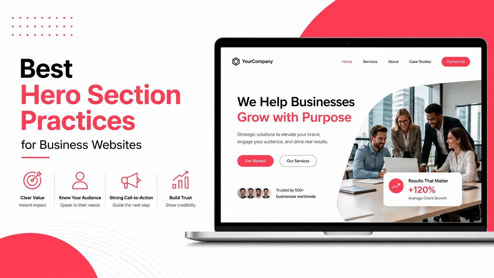
The hero section is one of the most important areas of a business website because it is usually the first major content visitors encounter. It needs to communicate the business's value quickly, establish the right visual impression, and give visitors a clear reason to continue exploring.
A strong hero section doesn't try to explain everything about a company. Instead, it answers three fundamental questions:
What does this business offer? Why does it matter to me? What should I do next?
That makes hero-section design a combination of copywriting, visual hierarchy, user experience, branding, and conversion strategy. Current design guidance consistently emphasizes clarity, focused calls to action, responsive layouts, and purposeful visuals rather than decorative complexity.
Quick Answer
The best hero section practices for business websites are:
- Communicate the main value proposition immediately
- Write a specific, benefit-focused headline
- Use supporting copy to add context
- Provide one clear primary CTA
- Choose visuals that reinforce the message
- Create a strong visual hierarchy
- Keep important content visible without unnecessary scrolling
- Optimize the hero for mobile devices
- Use relevant trust signals
- Maintain strong text-to-background contrast
- Optimize images and videos for performance
- Test different versions instead of relying only on design assumptions
The best hero section isn't necessarily the most visually dramatic. It is the one that helps the right visitor understand the business and take the next appropriate step.
What Is a Website Hero Section?
A hero section is the prominent content area near the top of a webpage, usually immediately below the navigation.
It commonly contains:
- Main headline
- Supporting text
- Primary CTA
- Image, illustration, product screenshot, or video
- Optional trust indicator
It is often described as the above-the-fold area because much of it can be visible before the visitor scrolls.
However, "above the fold" doesn't represent one fixed screen size. A desktop monitor, tablet, and smartphone display very different amounts of content. Therefore, hero sections should be designed responsively rather than around a single screen dimension.
The hero's purpose is not to contain everything.
It should provide enough information to make visitors think:
"I'm in the right place."
Why the Hero Section Matters
Visitors often scan a new website before deciding whether to explore further.
If the first screen is visually attractive but unclear, the design has failed an important business objective.
A strong hero section can:
- Explain the core offer
- Establish brand positioning
- Direct attention
- Introduce a key benefit
- Build initial trust
- Encourage the next action
- Create continuity between advertising and the website
For example, a web development company shouldn't make its hero headline so abstract that visitors can't determine what the company actually does.
"Building Digital Possibilities"
sounds polished but provides little information.
Compare it with:
"High-Performance Websites for Growing UAE Businesses"
The second version immediately communicates the service and audience.
Clarity generally matters more than cleverness.
Write a Clear, Benefit-Focused Headline
The headline is usually the most prominent piece of text in the hero.
Its job is to communicate the central value proposition quickly.
A useful headline should answer at least one of these questions:
- What does the business provide?
- Who is it for?
- What problem does it solve?
- What outcome can customers expect?
Instead of focusing entirely on features, consider the benefit.
Feature-focused:
"Advanced Cloud Accounting Platform"
Benefit-focused:
"Manage Your Business Finances From Anywhere"
The right approach depends on the business and audience, but the principle remains the same:
Make the value easy to understand.
Avoid headlines that require visitors to read several paragraphs before understanding the offer.
Use Supporting Copy to Add Context
The subheadline should support the main headline rather than repeat it.
It can explain:
- Who the service is designed for
- How the solution works
- A key differentiator
- A specific outcome
- An important qualification
For example:
Headline:
"Custom Ecommerce Websites Built for UAE Businesses"
Supporting copy:
"Create a faster, mobile-friendly shopping experience designed around your products, customers, and growth goals."
The headline establishes the main proposition.
The supporting copy provides context.
Keeping this relationship clear helps visitors process the message without unnecessary cognitive effort.
Use One Primary CTA
A hero section should normally have one clearly dominant action.
Examples include:
- Get a Free Quote
- Book a Consultation
- Start Your Free Trial
- Shop Now
- View Our Services
- Schedule a Demo
- Contact Our Team
CTA wording should tell visitors what will happen when they click.
"Submit" provides little context.
"Request a Free Quote" communicates the outcome more clearly.
A secondary CTA can be appropriate when the audience has different levels of intent, but it shouldn't visually compete with the primary action.
The goal isn't to prevent visitors from having choices.
It is to make the preferred next step obvious.
Choose Visuals That Support the Message
A hero image should do more than fill empty space.
Good visuals can:
- Demonstrate the product
- Show the service in use
- Communicate the target audience
- Reinforce the brand personality
- Create emotional context
- Explain something that would take too much text to describe
For ecommerce businesses, a product-focused hero image can immediately establish what is being sold.
For SaaS companies, a product interface or workflow can demonstrate how the solution works.
For service businesses, authentic project photography can communicate credibility.
Generic stock photography can be less effective when it doesn't add meaningful information.
A visual should answer:
"Why is this image here?"
If removing the image makes no difference to the visitor's understanding or perception, it may be decorative rather than strategic.
Create a Strong Visual Hierarchy
A hero section shouldn't make every element equally prominent.
Visitors should naturally move through the content in an intentional sequence.
A typical hierarchy might look like:
Headline → Supporting copy → CTA → Supporting visual
Visual hierarchy can be created through:
- Font size
- Font weight
- Contrast
- Position
- Spacing
- Color
- Image scale
The CTA should be noticeable without overpowering the headline.
The supporting image should complement the message rather than competing with it.
This principle extends beyond the hero. Businesses can explore these website design principles for a broader understanding of hierarchy, spacing, balance, and consistency.
Design for Mobile First
A hero that looks excellent on a desktop monitor can become problematic on a smartphone.
Mobile layouts have significantly less horizontal space, which can cause:
- Headlines to wrap into too many lines
- Buttons to become cramped
- Images to dominate the screen
- Supporting text to become difficult to read
- Important CTAs to move too far down the page
Responsive hero design should therefore be tested across different screen sizes.
Pay attention to:
- Headline length
- Font size
- Button dimensions
- Image cropping
- Text contrast
- Vertical spacing
- Navigation height
- CTA position
Mobile users should not receive a poorly compressed version of the desktop experience.
They need a deliberately designed layout.
For ecommerce businesses, current guidance also emphasizes mobile-specific hero imagery, touch-friendly controls, and testing on real devices rather than relying solely on desktop layouts or browser emulation.
Use Trust Signals Without Cluttering the Hero
Trust can be particularly important when visitors don't already know the business.
A small trust element can support the main proposition without overwhelming the design.
Examples include:
- Customer rating
- Number of customers
- Client logos
- Industry certification
- Short testimonial
- Years of experience
- "Trusted by..." statement
For example:
"Trusted by 500+ UAE businesses"
can provide useful context if the claim is genuine and verifiable.
However, avoid filling the hero with every award, certification, review, and company logo.
Trust signals should support the message—not compete with it.
Keep Hero Sections Fast and Accessible
Hero visuals are often among the largest elements on a webpage, so performance deserves attention.
Large images, autoplay videos, animations, and unnecessary scripts can increase loading time.
Practical optimization includes:
- Compressing images
- Using modern image formats
- Choosing appropriate dimensions
- Avoiding unnecessarily large videos
- Limiting heavy animations
- Preloading critical resources where appropriate
- Maintaining readable text contrast
For an image-heavy hero, performance can become particularly important because the hero may contain the page's largest visible image. Shopify's current guidance specifically highlights image file size and mobile optimization as important considerations for ecommerce hero sections.
Accessibility matters too.
Make sure:
- Text remains readable
- Contrast is sufficient
- Buttons are easy to identify
- Interactive elements are keyboard accessible
- Important information isn't communicated only through imagery
- Images have appropriate alternative text when needed
A beautiful hero that some visitors cannot comfortably use is not a successful hero.
Match the Hero to User Intent
Your hero should reflect why the visitor arrived.
Someone searching for:
"Dubai accounting services"
shouldn't land on a hero dominated by a vague statement such as:
"Empowering Your Financial Future."
The visitor needs immediate relevance.
A more useful headline could be:
"Professional Accounting Services for Dubai Businesses"
The same principle applies to advertising campaigns.
If an advertisement promotes a specific service, the landing page should reinforce that same offer rather than forcing visitors to search through the homepage.
Message consistency reduces confusion and reassures visitors that they reached the correct destination.
Make the Hero Match the Brand
The hero is not a separate design exercise.
It should feel like part of the overall brand.
Consider consistency across:
- Colors
- Typography
- Photography
- Illustration style
- Tone of voice
- Buttons
- Icons
- Spacing
- Visual language
A premium brand may use restrained typography, strong imagery, and generous white space.
A technology startup might use sharper visual contrast, interface screenshots, and more dynamic graphics.
The design should reinforce what the business wants customers to perceive.
Don't Make the Hero Too Tall
A full-screen hero can look impressive, but it isn't automatically better.
If visitors see nothing except a giant image and have to scroll to understand the business or find the CTA, valuable information has been pushed out of the initial experience.
Hero height should be determined by the content and objective rather than by a rigid design trend.
Check the hero across common desktop and mobile viewports.
Make sure the essential message remains easy to discover.
Current design guidance similarly recommends avoiding excessive hero height and ensuring that important messaging and CTAs remain accessible across different screen sizes.
Test the Hero Instead of Guessing
Even experienced designers can't predict exactly how every audience will respond to a particular headline, image, or CTA.
Testing can reveal useful differences.
Consider testing:
- Headline variations
- CTA wording
- CTA placement
- Image vs product screenshot
- Background color
- Supporting copy
- Trust elements
- Different mobile layouts
Measure outcomes such as:
- CTA clicks
- Scroll depth
- Form starts
- Form completions
- Engagement
- Qualified leads
- Sales
A hero that looks better isn't necessarily the hero that performs better.
The business objective should determine the winner.
Common Hero Section Mistakes
Vague Headlines
Creative language is not useful if visitors cannot understand the offer.
Too Many CTAs
Multiple competing actions can dilute the primary objective.
Decorative Visuals
A beautiful image that communicates nothing can distract from the actual message.
Generic Stock Photography
Unrelated imagery can make a business feel interchangeable.
Huge Autoplay Videos
Heavy video backgrounds can create performance and usability problems.
Poor Mobile Layouts
A desktop-first hero can become difficult to use on smaller screens.
Low Text Contrast
Text placed over busy imagery can become difficult to read.
Excessive Content
The hero should introduce the offer, not contain the entire website.
Missing Trust
For unfamiliar brands, providing no credibility signal can increase hesitation.
Key Takeaways
- The hero section should immediately communicate what the business offers.
- A clear value proposition is more useful than an abstract slogan.
- Supporting copy should add context rather than repeat the headline.
- Use one dominant CTA that clearly communicates the next step.
- Choose visuals that reinforce the message.
- Create a deliberate visual hierarchy.
- Design and test the hero for mobile devices.
- Use relevant trust signals without overcrowding the layout.
- Optimize large images and videos for performance.
- Match hero messaging with search, advertising, and visitor intent.
- Keep branding consistent across the hero and the rest of the website.
- Test different versions using actual user behavior and conversion data.
Conclusion
A business website's hero section has a difficult job: it needs to capture attention without distracting, communicate value without overwhelming, and encourage action without creating pressure.
The most effective approach is usually simpler than many businesses expect.
Start with a clear headline. Explain the value. Use a relevant visual. Provide a specific CTA. Add enough trust to reduce uncertainty. Then make sure the entire experience works just as well on mobile as it does on desktop.
The hero should not try to tell the visitor everything.
It should give them a compelling reason to keep going.
For businesses that want to build hero sections around usability, visual hierarchy, brand positioning, and conversion objectives, UI/UX design services in Dubai can help turn these principles into a cohesive website experience. Milaaj Brandset helps businesses combine design, branding, and digital experiences around clear business goals.
Ultimately, the strongest hero section answers three questions quickly:
What do you offer? Why should I care? What should I do next?
If visitors can answer those questions without thinking too hard, the hero is doing its job.
Frequently Asked Questions
What should a business website hero section contain?
A typical hero section includes a clear headline, supporting copy, a primary CTA, and a relevant visual. Depending on the business, it may also include a small trust signal such as a customer rating or client logo.
How long should a hero headline be?
There is no universal word limit, but it should communicate the core value proposition quickly. Short, specific headlines are generally easier to scan than long, complicated statements.
Should a hero section have one CTA or multiple CTAs?
One primary CTA is usually best when there is a clear conversion goal. A secondary CTA can be useful when visitors have different levels of intent, provided it doesn't compete visually with the primary action.
Should the hero section always fill the entire screen?
No. Full-screen heroes can work for some brands, but the appropriate height depends on the content, audience, device, and objective. Essential information shouldn't be pushed too far below the initial view.
Are hero videos good for business websites?
They can be effective when they communicate something meaningful, but large or autoplaying videos can hurt performance and distract from the core message. A static or lightweight visual may be better when speed and clarity are priorities.
How do I know whether my hero section is effective?
Look beyond aesthetics. Monitor CTA clicks, engagement, scroll behavior, form completions, qualified leads, and conversions. A/B testing different headlines, visuals, and CTAs can help identify what works best for your audience.
Ready to Elevate Your Brand?
Start Your Project Today