August 21, 2026
Color Psychology in Website Design & Branding: A Practical Guide
Milaaj Editorial / Research Insights
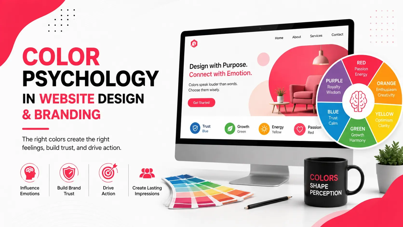
Color is one of the first things people notice when they interact with a brand or website. Before visitors read a headline or explore a product, the colors surrounding that content can already influence how the business feels.
A professional blue palette may communicate trust and stability. A vibrant orange may feel energetic and approachable. Black can create a premium impression, while green is often associated with nature, health, or growth.
But color psychology isn't about assigning one fixed emotion to every color.
The meaning of a color depends on context, audience, industry, culture, contrast, and how the color is used within the overall design.
For businesses, the goal is not simply to choose attractive colors. It is to create a visual system that supports brand recognition, communicates the right personality, improves usability, and guides visitors through the website.
Quick Answer
Color psychology in website design is the use of color to influence visual perception, communicate brand personality, establish hierarchy, and shape how users experience a digital interface.
Effective color strategies generally involve:
- Choosing colors that match the brand personality
- Creating a consistent color palette
- Using contrast to improve readability
- Applying accent colors strategically
- Using CTA colors consistently
- Considering accessibility
- Understanding cultural context
- Maintaining consistency across digital and offline touchpoints
- Testing colors rather than relying entirely on assumptions
The most effective website color palette isn't necessarily the most colorful one. It is the one that makes the brand recognizable while helping users understand and navigate the website.
What Is Color Psychology in Website Design?
Color psychology refers to how colors can influence people's perceptions, associations, and emotional responses.
In website design, colors can affect how visitors perceive:
- Trust
- Professionalism
- Energy
- Luxury
- Simplicity
- Creativity
- Security
- Sustainability
- Affordability
However, color responses aren't universal.
A person's experiences, cultural background, age, industry expectations, and the surrounding design can influence interpretation.
For example, red can represent urgency or excitement, but it can also communicate danger or warning.
Therefore, website designers shouldn't ask:
"What does red mean?"
A better question is:
"What does this particular use of red communicate within this brand and interface?"
Why Colors Matter in Branding
Color can become a powerful part of brand recognition.
When businesses consistently use a particular color combination across websites, advertisements, packaging, social media, and physical materials, those colors can become associated with the brand.
A strong color system can help communicate:
- Brand personality
- Market positioning
- Product category
- Emotional tone
- Visual consistency
This is why choosing colors should happen alongside other branding decisions rather than being treated as a final website-design step.
A business developing or refreshing its visual identity should consider building a strong brand identity so that its color choices support a broader and more consistent brand system.
How Different Colors Influence Brand Perception
There are common psychological associations with colors, but they should be treated as general tendencies rather than universal rules.
Red
Red is often associated with:
- Energy
- Urgency
- Passion
- Excitement
- Action
It can work well for brands that want to create energy or encourage immediate attention.
However, excessive red can become overwhelming, particularly when used across large areas.
Blue
Blue commonly communicates:
- Trust
- Reliability
- Stability
- Professionalism
- Security
It is frequently used by technology, financial, healthcare, and corporate brands.
Different shades create different impressions. Dark navy can feel formal and established, while brighter blue can feel more energetic and modern.
Green
Green is commonly associated with:
- Nature
- Health
- Growth
- Sustainability
- Freshness
Its effectiveness depends heavily on context.
Yellow
Yellow can communicate:
- Optimism
- Happiness
- Energy
- Friendliness
Because bright yellow can create strong visual intensity, it often works best as an accent rather than as the dominant text or background color.
Orange
Orange often creates an impression of:
- Enthusiasm
- Creativity
- Approachability
- Energy
It can be useful for brands that want to appear energetic without the intensity sometimes associated with red.
Purple
Purple is frequently associated with:
- Creativity
- Imagination
- Premium positioning
- Sophistication
It can work particularly well for creative, beauty, lifestyle, and premium brands.
Black
Black can communicate:
- Luxury
- Authority
- Sophistication
- Minimalism
- Strength
It can create a premium visual identity when balanced with appropriate typography, spacing, imagery, and contrast.
White
White often communicates:
- Simplicity
- Cleanliness
- Openness
- Minimalism
White space is also extremely valuable in website design because it gives other elements room to stand out.
Choose Website Colors Based on Brand Personality
Don't choose website colors simply because they're visually attractive.
Start by defining the personality you want the brand to communicate.
For example:
Professional + trustworthy → restrained blues, neutrals, and controlled accents
Premium + sophisticated → black, deep tones, metallic-inspired accents, and generous white space
Natural + sustainable → greens, earth tones, and natural neutrals
Energetic + youthful → vibrant accents and stronger contrast
Minimal + modern → neutral foundations with one distinctive accent
Once the personality is clear, colors become easier to evaluate.
A palette should answer a simple question:
Does this look and feel like the brand we want customers to remember?
Use Color to Create Visual Hierarchy
Color isn't only decorative.
It can help visitors understand what deserves attention.
For example, a website could use:
- Neutral colors for backgrounds
- Dark colors for primary text
- A secondary color for supporting elements
- A strong accent for important actions
This creates a visual hierarchy without making everything equally prominent.
If every button, heading, banner, icon, and section uses a bright accent color, nothing feels important.
Good color systems create visual priorities.
This works alongside spacing, typography, imagery, and layout.
For a broader look at how these elements work together, businesses can explore these website design principles.
Choose Effective Colors for CTAs
Call-to-action buttons are one of the most important places to use accent colors strategically.
Examples include:
- Buy Now
- Get a Quote
- Book a Consultation
- Contact Us
- Start a Free Trial
The CTA should be easy to identify without appearing disconnected from the rest of the interface.
A common mistake is assuming that one specific color always produces better conversions.
There is no universal "best CTA color."
What matters is:
- Contrast
- Visibility
- Consistency
- Context
- Brand fit
- Clarity of the CTA itself
A button that clearly stands out from its surrounding content can be more effective than one that blends into the page.
Balance Brand Colors With Website Usability
A brand may have strong primary colors, but that doesn't mean every website element should use them.
A balanced website might use:
Primary color: Brand recognition
Secondary color: Supporting sections and components
Accent color: Actions and important highlights
Neutral colors: Backgrounds and content areas
This allows the brand color to remain distinctive without overwhelming visitors.
For example, a bright brand color might work beautifully for buttons and highlights but become uncomfortable when used as a full-page background.
The design should protect both brand expression and usability.
Consider Accessibility and Color Contrast
A visually attractive color combination can still create accessibility problems.
Text needs sufficient contrast against its background.
Common problems include:
- Light gray text on white
- Yellow text on white
- Dark blue text on black
- Low-contrast button labels
- Information communicated only through color
Color should not be the only method used to communicate meaning.
For example, an error message shouldn't rely solely on red. It can also include:
- An error icon
- Clear text
- Appropriate positioning
- Supporting instructions
This helps people who have color-vision differences and improves general usability.
Businesses working on inclusive digital experiences can also review UI/UX best practices for business websites.
Think About Cultural Differences in Color Meaning
Color meanings can vary between cultures.
This matters particularly for businesses operating across international markets.
A color associated with celebration in one culture may have a very different association somewhere else.
For UAE businesses serving customers from different countries, this becomes particularly relevant.
Rather than relying on a generic color-meaning chart, consider:
- Target audience
- Geographic market
- Cultural expectations
- Industry norms
- Product category
- Brand positioning
The goal is to avoid assuming that every audience will interpret a color in exactly the same way.
Keep Website and Brand Colors Consistent
Consistency makes a brand easier to recognize.
The same core palette should generally appear across:
- Website
- Social media
- Advertisements
- Email campaigns
- Presentations
- Packaging
- Business documents
- Physical branding
That doesn't mean every design needs to look identical.
Instead, establish a clear color system with defined roles.
For example:
Color Role | Typical Purpose |
|---|---|
Primary | Brand recognition |
Secondary | Supporting elements |
Accent | CTAs and highlights |
Neutral | Backgrounds |
Text | Content and navigation |
Status | Success, warning, error |
This makes the brand easier to manage as more marketing materials are created.
Common Color Psychology Mistakes
Choosing Colors Based Only on Trends
A trendy palette may look modern today but fail to communicate the brand's personality.
Using Too Many Colors
Too many competing colors make a website visually confusing.
Making Every Element Bright
If everything demands attention, nothing has clear priority.
Ignoring Contrast
Brand colors still need to meet practical readability requirements.
Copying Competitors
Industry conventions can be useful, but copying another brand's palette can make differentiation difficult.
Assuming Color Guarantees Conversions
Color can influence perception and attention, but it cannot compensate for weak messaging, poor UX, or an unclear offer.
Changing Colors From Page to Page
Inconsistent colors can make a website feel disconnected and weaken brand recognition.
How to Build a Practical Website Color Palette
A simple process can make color selection more systematic.
Step 1: Define the brand personality
Choose three to five characteristics that describe the desired brand perception.
Step 2: Select a primary color
This becomes the strongest visual representation of the brand.
Step 3: Add supporting colors
Choose complementary colors that work with the primary shade.
Step 4: Add neutral colors
Use white, gray, black, or other neutrals for backgrounds and content.
Step 5: Define functional colors
Consider separate colors for:
- Success
- Warning
- Error
- Information
Step 6: Test the palette
Check it across:
- Desktop
- Mobile
- Light backgrounds
- Dark backgrounds
- Buttons
- Forms
- Text
- Images
This creates a system rather than a collection of attractive colors.
Key Takeaways
- Color psychology can influence how visitors perceive a website and brand.
- Color meanings depend on context rather than following universal rules.
- Brand personality should guide color selection.
- Color can create hierarchy and direct attention toward important elements.
- CTA colors should provide clear contrast while remaining consistent with the brand.
- Accessibility and readability should always be considered.
- Cultural differences matter when targeting international audiences.
- A limited, well-defined palette is usually easier to manage than many competing colors.
- Website colors should remain consistent across digital and offline brand touchpoints.
- Color alone doesn't determine conversions; it works alongside content, UX, layout, and branding.
Conclusion
Color psychology can be a valuable tool for creating websites that feel intentional, recognizable, and easier to navigate. But effective color selection isn't about following rigid rules such as "blue means trust" or "red increases sales."
The strongest approach considers the brand, audience, industry, cultural context, accessibility, and overall user experience together.
A thoughtful color system can strengthen visual hierarchy, make calls to action easier to identify, improve brand recognition, and create a more cohesive digital experience.
For businesses developing a consistent visual identity across their website and wider marketing presence, brand identity development can help connect colors with typography, visual elements, messaging, and the broader brand system. Milaaj Brandset helps businesses develop digital and branding experiences that are designed to communicate clearly and consistently.
Ultimately, the best website color palette isn't the one with the most impressive collection of colors.
It's the one that makes the brand recognizable, the interface understandable, and the experience comfortable for the people using it.
Frequently Asked Questions
Does color psychology really affect website visitors?
Color can influence perception, attention, emotional associations, and visual interpretation. However, its effect depends on context, audience, culture, design, and the way the color is applied.
What is the best color for a business website?
There is no universally best color. The right choice depends on the brand personality, target audience, industry, positioning, and overall design system.
How many colors should a website use?
A website can often work effectively with a primary color, one or two supporting colors, appropriate accents, and neutral colors. The exact number depends on the design and brand requirements.
What color is best for CTA buttons?
There is no universal best CTA color. The most important factors are contrast, visibility, consistency, context, and whether the color fits the overall brand.
Why is color contrast important in website design?
Good contrast makes text, buttons, icons, and other interface elements easier to see and use. It is particularly important for accessibility.
Should UAE businesses consider cultural differences when choosing colors?
Yes. UAE businesses often serve diverse audiences, so color associations can vary between customer groups. Cultural context should be considered alongside brand positioning and usability.
Ready to Elevate Your Brand?
Start Your Project Today