November 25, 2025
Why Mobile-First Web Design Matters for Your Business
Milaaj Editorial / Research Insights
The way users experience the internet has drastically changed. A decade ago, desktop browsing dominated online behavior. Today, mobile accounts for over half of all global web traffic, and for many industries, it’s much higher. Customers aren’t just browsing on mobile — they’re researching, comparing, signing up, purchasing, and interacting with brands entirely from their phones.
And yet, many businesses still treat mobile design as a secondary step.
This is where mobile-first web design becomes a game-changing strategy. It doesn’t just ensure your website “looks good on phones.” It positions your brand for long-term visibility, trust, conversions, and growth.
This article breaks down exactly why mobile-first matters, how it impacts SEO and user experience, and how it strengthens your overall brand identity.
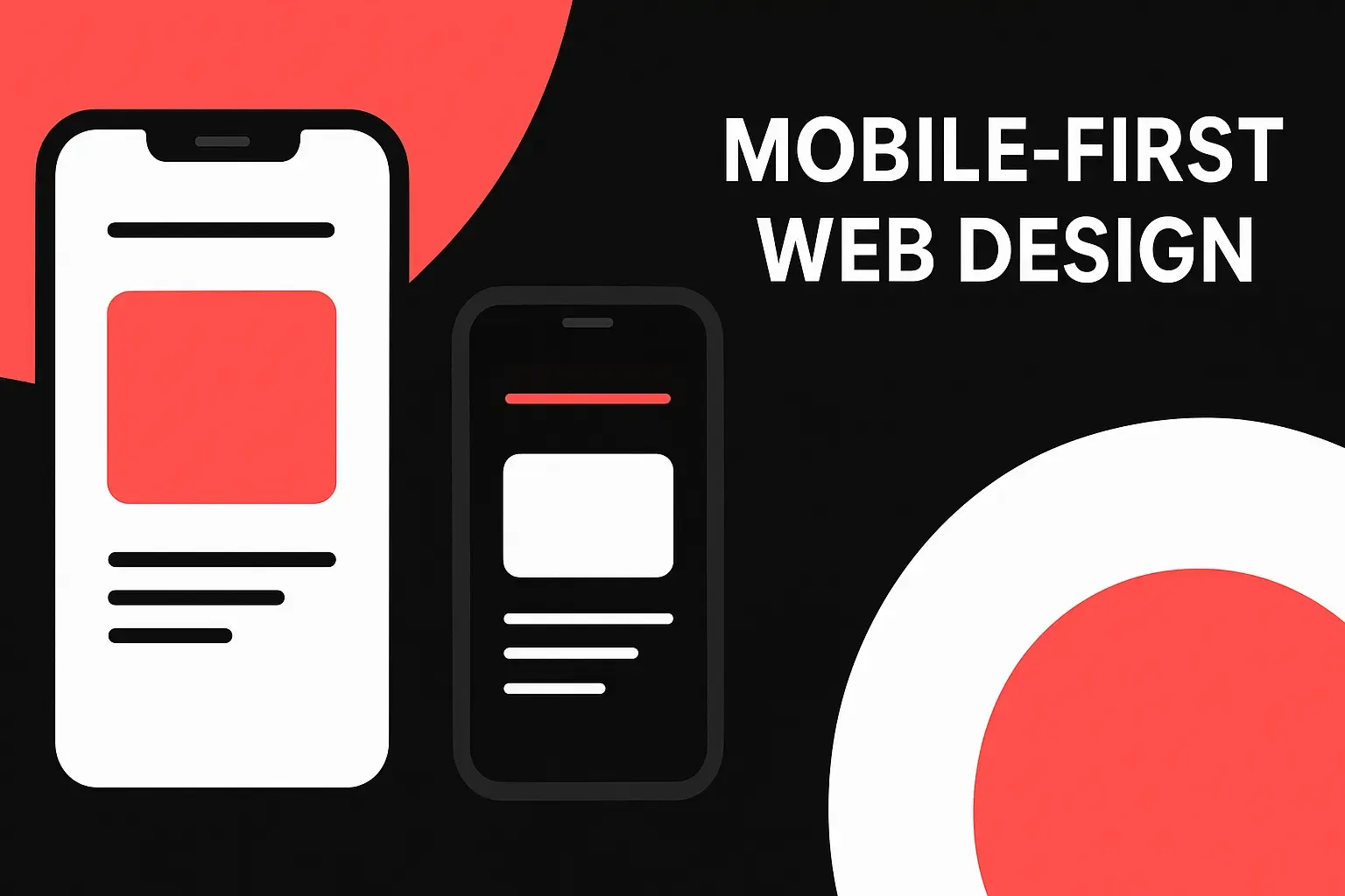
What Exactly Is Mobile-First Web Design?
Mobile-first design is an approach where the mobile version of a website is designed before the desktop version. This might sound reversed from the traditional process, but it has strong strategic logic:
- Most users visit from mobile first.
- Google evaluates mobile performance for rankings.
- Mobile screens require cleaner, more focused design.
Instead of trying to shrink a full-sized desktop website into a tiny screen, mobile-first starts by building what matters most:
- Essential content
- Clean layout
- Easy navigation
- Smooth touch interactions
- Fast load performance
Then, once the mobile version is strong, designers scale upward for larger screens.
This ensures the foundation of your website is built around actual modern user behavior.
Why Mobile-First Web Design Matters for Your Business
1. Your Customers Are Already Choosing Mobile Over Desktop
Consumers rely on their smartphones for almost everything:
- Searching for nearby businesses
- Reading reviews
- Browsing services
- Checking prices
- Calling, chatting, or filling forms
When your website doesn’t load quickly or doesn’t fit well on mobile screens, users leave within seconds. This instantly costs:
- Leads
- Sales
- Organic traffic
- Brand credibility
A mobile-first website provides a smooth, frictionless journey that matches how your customers already behave.
2. Google Ranks Based on Mobile Performance
Google now uses mobile-first indexing, meaning:
If your mobile site is slow, cluttered, or poorly optimized, your rankings drop — even if the desktop version is perfect.
Mobile-first design helps you:
- Improve search visibility
- Boost organic traffic
- Achieve higher keyword rankings
- Meet Google’s Core Web Vitals
This makes it an essential part of modern SEO, not optional.
3. Faster Loading = Higher Conversions
Speed is everything on mobile.
- A 1-second delay can reduce conversions significantly
- Slow websites lead to higher bounce rates
- Users expect instant, responsive interactions
Mobile-first websites are built streamlined, making them:
- Lighter
- Faster
- More efficient
- More user-friendly
This leads to higher conversions for:
- Service inquiries
- Contact form submissions
- Ecommerce purchases
- App downloads
- Bookings and calls
Customers reward convenience — mobile-first delivers it.
4. It Improves Overall User Experience (UX)
Mobile-first forces clarity. There’s no room for clutter or unnecessary elements when designing for smaller screens.
This approach improves:
- Readability
- Navigation flow
- Touch accuracy
- Content hierarchy
- Interaction design
Mobile-first principles naturally align with strong UI and UX practices. Many businesses upgrade their mobile experience using modern UI/UX design methodologies to create a smoother, more intuitive journey for users.
A great user experience reduces friction, builds trust, and encourages engagement — all essential elements for brand success.
5. Strengthens Branding Through Consistency
Your website is one of your most important brand touchpoints. If your mobile experience feels different, cluttered, or inconsistent compared to your desktop version, it weakens your brand identity.
Mobile-first design ensures:
- Consistent styling
- Clear typography
- Strong color hierarchy
- Unified brand personality
Moreover, building a strong digital identity is easier when your foundation is simplified and modern. Many businesses even refine their brand identity while transitioning to mobile-first design — especially when supported by professional brand identity development services which help define your visual story across all digital platforms.
When your brand looks polished and cohesive on mobile, users instantly feel more confident engaging with you.
6. Helps You Stay Competitive in Your Industry
Most industries are becoming extremely digital. In competitive markets:
- Users won’t tolerate outdated websites
- Brands with strong mobile UX gain an edge
- Mobile-first sites improve credibility and trust
- External campaigns (ads, social, SEO) perform better
If your competitors already have mobile-first websites, you’ll fall behind quickly without one. If they don’t, transitioning early gives you a massive advantage.
7. Supports All Marketing Channels Better
Every digital channel relies on a mobile-friendly experience:
- Google Ads
- Social media campaigns
- Email marketing
- Influencer traffic
- WhatsApp marketing
- Organic SEO
Users often click from mobile apps directly into websites.
If your landing page doesn’t load fast or look clean on mobile, campaigns underperform — costing you money.
A mobile-first approach ensures maximum ROI across all marketing channels.
8. Boosts Local and Service-Based Business Visibility
For local searches like:
- “repair shop near me”
- “best salon in my area”
- “digital marketing agency in UAE”
Most users search from their phones while on the move.
Google prioritizes businesses whose websites:
- Load fast
- Are mobile-friendly
- Provide quick access to contact info
If you’re a local or service-focused business, mobile-first design significantly improves:
- Local SEO
- Map visibility
- Call button clicks
- Store visits
- Appointment bookings
Mobile-first helps potential customers reach you instantly.
Mobile-First vs. Responsive Web Design — What’s the Difference?
Many business owners confuse these two, but they’re not the same.
Responsive Design
Desktop website → then adjusted for smaller screens
(“Shrinks” content down)
Mobile-First Design
Mobile version → then expanded for desktop
(Builds upward from essentials)
Mobile-first creates a cleaner, clearer, more optimized user experience — responsive design cannot match the precision and intent behind it.
How Mobile-First Design Impacts Your Brand Identity
Your brand identity is not just your logo and colors — it’s the feeling users associate with your business.
A mobile-first website strengthens your brand by ensuring:
- Professional visual flow
- Strong color accents
- Clear spacing
- Modern, minimal layout
- Unified storytelling across devices
This makes your brand appear:
- More premium
- More trustworthy
- More relatable
- More modern
- More authoritative
Many businesses pair their web redesign with updated brand identity development to ensure the digital experience matches their brand voice, colors, and style.
When your mobile website reflects the best version of your brand, users respond with confidence.
When Should You Consider Switching to Mobile-First?
If any of this applies, it's time:
- Your website loads slowly on phones
- Users must zoom in to read text
- Buttons are small or hard to tap
- The layout breaks on small screens
- You have high bounce rates on mobile
- You’re planning a redesign
- You need better SEO performance
A mobile-first approach is especially necessary when improving:
- Lead generation
- Online sales
- Local search visibility
- Brand perception
- Marketing ROI
Future-Proofing Your Business with Mobile-First Strategy
Mobile usage will only increase in the coming years.
A mobile-first design primes you for:
- New device types
- New browser changes
- Faster 5G/6G internet
- Voice search growth
- Evolving user behaviors
Your website becomes adaptable, flexible, and ready for future digital expectations.
Mobile-first is not just a design strategy —
➡️ It is a long-term business strategy.
Conclusion
Mobile-first web design is no longer optional. It is the foundation of modern digital success. From stronger SEO rankings to better user experience, higher conversions, and a more polished brand identity, prioritizing mobile helps your business thrive where your customers already are.
Brands that invest in mobile-first design often take the opportunity to refine their entire brand presentation — and exploring brand identity development is a key step toward delivering a cohesive, memorable experience across every device and platform.
A mobile-first approach ensures your business stays relevant, competitive, and future-ready.
FAQs
1. Is mobile-first design required for SEO?
Yes. Google uses mobile performance to determine rankings. A weak mobile site hurts SEO even if the desktop version is good.
2. Does mobile-first design cost more?
Not usually. In many cases, it streamlines the design process and reduces unnecessary complexity.
3. How long does it take to convert a site to mobile-first?
It depends on size and functionality, but the process is often faster than full redesigns because it focuses on essentials first.
4. Do all business types need mobile-first websites?
Yes — ecommerce, services, corporate, personal brands, and local businesses all benefit because customers universally browse via smartphones.


Ready to Elevate Your Brand?
Start Your Project Today