August 22, 2026
Psychology of High-Converting Landing Pages: A Practical Guide
Milaaj Editorial / Research Insights
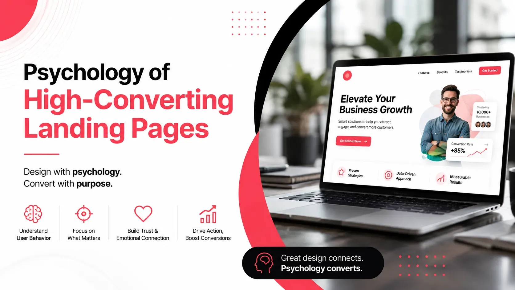
A landing page can have an attractive design, persuasive copy, and a prominent call-to-action yet still struggle to generate conversions.
Why?
Because conversion is not only a design problem. It is also a human behavior problem.
Visitors arrive with different expectations, concerns, motivations, and levels of awareness. Some are ready to buy, while others are still comparing options. A high-converting landing page recognizes these differences and reduces the psychological barriers that prevent people from taking action.
Understanding landing page psychology helps businesses create experiences that capture attention, communicate value, build confidence, and make decisions easier.
The goal isn't to manipulate visitors.
It is to remove unnecessary uncertainty and make the right action feel clear and worthwhile.
Quick Answer
The psychology of a high-converting landing page revolves around several key principles:
- Capture attention quickly
- Match the visitor's intent
- Communicate one clear value proposition
- Reduce cognitive load
- Build trust before asking for action
- Use social proof to reduce uncertainty
- Create a clear visual hierarchy
- Make calls to action easy to understand
- Reduce unnecessary form friction
- Use urgency honestly
- Address customer objections
- Keep the experience consistent from ad to landing page
A landing page converts better when visitors can quickly understand what is being offered, why it matters, why they should trust the business, and what they should do next.
What Makes a Landing Page High-Converting?
A high-converting landing page isn't simply one that looks professional.
It aligns several elements around a specific user action.
These typically include:
Audience → Problem → Value → Proof → Action
The visitor should quickly understand:
- What is this?
- Is it relevant to me?
- What will I gain?
- Can I trust this business?
- What should I do next?
If the page makes visitors search for these answers, conversion friction increases.
This is why landing pages usually perform better when they focus on one primary objective rather than presenting every product, service, company detail, and promotion simultaneously.
How Attention Works on Landing Pages
Visitors don't initially read a landing page word by word.
They scan.
The first few seconds are therefore important.
A strong landing page typically establishes its main message through:
- Headline
- Supporting statement
- Relevant visual
- Primary CTA
- Key benefit
The headline should communicate the central value proposition rather than forcing visitors to interpret vague marketing language.
For example:
Weak:
"Transform Your Digital Future"
Clearer:
"Launch Your UAE Ecommerce Store in Weeks"
The second headline immediately provides context.
Attention becomes more valuable when it is directed toward information that helps visitors make a decision.
Reduce Cognitive Load and Decision Friction
Cognitive load refers to the mental effort required to process information.
A landing page can increase cognitive load by presenting:
- Too many choices
- Long paragraphs
- Multiple competing CTAs
- Complex navigation
- Unclear pricing
- Unfamiliar terminology
- Excessive visual elements
When visitors have to work too hard to understand the offer, they may simply leave.
A better landing page guides visitors through a logical sequence.
Problem → Solution → Benefits → Proof → Action
This doesn't mean every landing page must follow exactly the same structure.
It means the information should feel easy to process.
Businesses can also explore UI/UX best practices for business websites to understand how navigation, hierarchy, spacing, and usability can reduce friction across digital experiences.
Use Clear Messaging to Match User Intent
One of the biggest landing-page mistakes is creating content around what the business wants to say rather than what the visitor wants to know.
Someone searching for:
"emergency AC repair Dubai"
has a very different intent from someone searching:
"how does AC maintenance work?"
The first person may need immediate assistance.
The second may still be researching.
A landing page should reflect the intent that brought visitors there.
This is particularly important for paid advertising.
If an advertisement promises one thing and the landing page talks about something else, visitors may become confused or feel misled.
The headline, offer, imagery, and CTA should create a consistent journey from the original search or advertisement to the landing page.
Build Trust Before Asking for Action
Visitors often have doubts before converting.
They may wonder:
- Is this company legitimate?
- Is the service worth the price?
- Have other customers used it?
- Will my information be safe?
- Can I cancel?
- What happens after I submit the form?
Landing pages should address these concerns before asking for significant commitment.
Trust can be established through:
- Customer reviews
- Testimonials
- Case studies
- Client logos
- Certifications
- Guarantees
- Transparent policies
- Company information
- Security signals
Trust signals are particularly important when the conversion involves money, personal information, or a long-term commitment.
For a deeper look at this topic, see trust signals on business websites.
Use Social Proof to Reduce Uncertainty
People often look at what others have done when making decisions.
This is known as social proof.
On landing pages, social proof can include:
- Customer reviews
- Ratings
- Testimonials
- Case studies
- Number of customers
- Client logos
- User-generated content
- Industry recognition
But social proof works best when it is relevant.
A testimonial from a customer who resembles the target audience can be more persuasive than a generic five-star statement.
For example, a B2B software company may benefit from showing testimonials from businesses in the same industry or company size.
Specificity creates credibility.
Create a Strong Visual Hierarchy
Visual hierarchy determines what visitors notice first, second, and third.
It can be created through:
- Size
- Contrast
- Position
- Typography
- Spacing
- Color
- Imagery
A landing page should make its most important message visually obvious.
For example:
Primary: Value proposition
Secondary: Supporting benefits
Tertiary: Proof and additional information
Action: Clear CTA
If every element has the same visual weight, visitors may struggle to determine where to focus.
Good hierarchy reduces the mental effort required to navigate the page.
Businesses can review these website design principles when developing a broader visual hierarchy that supports usability and communication.
Design CTAs Around User Motivation
A CTA is more than a button.
It represents the next step in the visitor's journey.
Generic phrases such as "Submit" often communicate little about what happens next.
More descriptive CTAs can create clearer expectations:
- Get My Free Quote
- Book a Consultation
- Start My Free Trial
- Download the Guide
- Schedule a Demo
- Check Availability
The CTA should also match the visitor's level of commitment.
Someone discovering a company for the first time may be more comfortable downloading a guide than booking a sales call.
The important question is:
What action naturally follows from the information the visitor has just consumed?
Use Urgency and Scarcity Carefully
Urgency can encourage action by highlighting a genuine time limitation.
Examples include:
- Limited enrollment
- Consultation availability
- Seasonal pricing
- Event registration deadlines
- Product availability
However, fake countdown timers and artificial scarcity can damage trust.
If visitors realize that a timer resets every time they reload the page, the psychological effect can reverse.
Ethical urgency works because the limitation is real.
Instead of manufacturing pressure, explain why acting now matters.
Reduce Form and Conversion Friction
Forms are common conversion barriers.
Every additional field asks the visitor to invest more effort.
A business may want:
- Name
- Email
- Phone
- Company
- Job title
- Industry
- Company size
- Budget
- Location
- Message
But does the visitor need to provide all of that before the first conversation?
Probably not.
Start with the information required to complete the immediate next step.
For example, a simple consultation request might initially need only:
Name + Email/Phone + Requirement
Additional information can be collected later.
Other friction-reduction techniques include:
- Clear field labels
- Helpful instructions
- Minimal required fields
- Mobile-friendly forms
- Visible privacy reassurance
- Clear error messages
- Confirmation after submission
The easier the action feels, the less likely visitors are to abandon it because of unnecessary effort.
Use Personalization Where It Helps
Personalization can make landing pages more relevant when it is based on meaningful differences in audience needs.
For example, separate landing pages might target:
- UAE startups
- E-commerce businesses
- Enterprise companies
- Healthcare businesses
- Real estate companies
The core service may remain the same, but the messaging can address the specific concerns of each audience.
Effective personalization answers:
"Why is this offer relevant to me?"
Poor personalization simply inserts someone's name into a generic message.
Relevance matters more than superficial customization.
Address Customer Objections Before They Become Barriers
Visitors often have questions that prevent conversion.
A strong landing page anticipates them.
Common objections include:
"Is this suitable for my business?"
→ Explain who the service is designed for.
"How much does it cost?"
→ Provide pricing or explain how quotes are calculated.
"How long will it take?"
→ Explain the expected process and timeline.
"Can I trust this company?"
→ Provide reviews, credentials, and case studies.
"What happens after I contact you?"
→ Explain the next steps.
An FAQ section can be useful here, particularly for more complex services.
The objective is not to make the page extremely long.
It's to provide the information necessary to overcome meaningful objections.
Common Landing Page Psychology Mistakes
Too Many Choices
Multiple competing offers and CTAs can create decision fatigue.
Vague Headlines
Visitors should understand the core offer quickly.
Too Much Information
More content isn't automatically more persuasive.
Weak Social Proof
Generic testimonials provide less confidence than specific, credible evidence.
Aggressive Urgency
Fake scarcity can damage trust.
Complicated Forms
Unnecessary fields increase friction.
Poor CTA Hierarchy
If every button looks equally important, visitors may not know which action to take.
Ignoring Mobile Users
A landing page that works on desktop but feels difficult on mobile can lose a significant portion of potential conversions.
Key Takeaways
- Landing-page conversion is strongly connected to human behavior.
- Visitors scan pages before deciding whether to read further.
- Clear messaging reduces cognitive load.
- Landing-page content should match search and advertising intent.
- Trust signals help reduce uncertainty.
- Relevant social proof can strengthen credibility.
- Visual hierarchy directs attention toward important information.
- CTA copy should clearly communicate the next step.
- Genuine urgency can encourage action, while fake scarcity can damage trust.
- Shorter, simpler forms generally create less friction.
- Personalization works best when it makes the offer genuinely more relevant.
- Addressing customer objections can remove barriers before they prevent conversion.
Conclusion
The psychology of high-converting landing pages isn't about manipulating people into clicking a button.
It is about understanding how people evaluate information, process choices, develop trust, and decide whether an action is worth taking.
A strong landing page gives visitors a clear answer to the questions that matter:
What is this? Why should I care? Can I trust it? What happens next?
When the page communicates value clearly, reduces unnecessary cognitive effort, provides credible evidence, and makes the next step easy, visitors have fewer reasons to hesitate.
Businesses that want to apply these principles at the design and development level can consider conversion-focused web design services to align landing-page structure, UX, performance, and business objectives. Milaaj Brandset helps businesses build digital experiences designed around both user needs and measurable business goals.
Ultimately, a high-converting landing page doesn't force a decision.
It makes the right decision easier to understand, trust, and take.
Frequently Asked Questions
What makes a landing page high-converting?
A high-converting landing page clearly communicates its value, matches visitor intent, builds trust, reduces friction, and provides an obvious next action.
Does landing-page psychology manipulate visitors?
It can be used poorly, but ethical conversion psychology is primarily about reducing confusion and uncertainty. The goal should be to help people make informed decisions rather than deceive them.
How important is the landing-page headline?
Extremely important. The headline is often one of the first elements visitors notice, so it should quickly communicate what the page offers and why it matters.
Should a landing page have multiple CTAs?
It can have multiple CTA instances, but they should generally support the same primary conversion objective. Several unrelated CTAs can create unnecessary decision-making friction.
Do testimonials increase landing-page conversions?
Relevant, authentic testimonials can increase confidence by providing social proof. Their effectiveness depends on credibility, specificity, placement, and relevance to the target audience.
Should landing pages be short or long?
There is no universal ideal length. Simple offers may need very little explanation, while complex or expensive products may require more information to overcome objections. The page should contain enough content to support the decision without adding unnecessary complexity.
Ready to Elevate Your Brand?
Start Your Project Today