July 16, 2026
How to Build a High-Converting Homepage: Best Practices
Milaaj Editorial / Research Insights
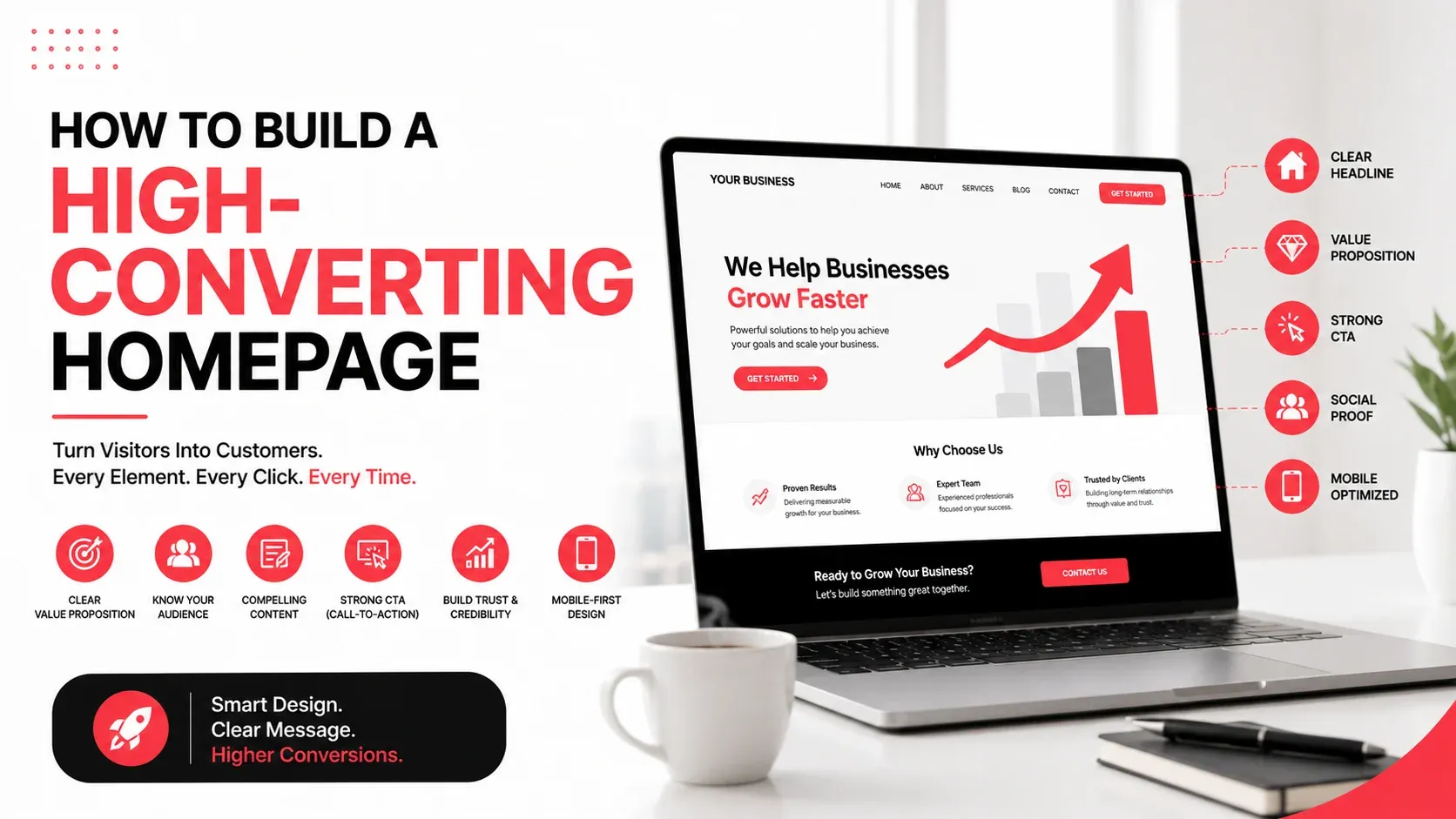
Your homepage is often the first interaction potential customers have with your business. Within a few seconds, visitors decide whether to continue exploring your website or leave. A well-designed homepage doesn't just look professional, it clearly communicates your value, builds trust, and guides visitors toward meaningful actions.
Many businesses focus heavily on visual design while overlooking the elements that influence conversions. Clear messaging, intuitive navigation, strategic calls-to-action, and credibility signals all work together to turn visitors into leads or customers.
In this guide, you'll learn the essential components of a high-converting homepage and practical ways to improve its performance.
Quick Answer
A high-converting homepage clearly explains what your business offers, communicates its unique value, builds trust through social proof, provides intuitive navigation, and guides visitors with strategic calls-to-action. Every section should help users quickly understand your business and confidently take the next step.
What Makes a Homepage High-Converting?
A homepage succeeds when it helps visitors answer three questions almost immediately:
- What does this business do?
- Why should I trust it?
- What should I do next?
If users struggle to find these answers, they are more likely to leave without exploring further.
An effective homepage balances design, content, and usability to create a smooth user journey. Rather than overwhelming visitors with information, it presents the right information at the right time.
Essential Elements of a High-Converting Homepage
A homepage should guide visitors naturally from discovery to action.
The following elements form the foundation of an effective homepage.
Homepage Element | Purpose |
|---|---|
Hero Section | Introduce your business and value proposition |
Navigation | Help users find information quickly |
Trust Signals | Build confidence and credibility |
Service Highlights | Explain your key offerings |
Testimonials | Reinforce customer trust |
Calls-to-Action | Encourage meaningful actions |
Footer | Provide supporting information and contact details |
Create a Clear Value Proposition
Your value proposition is the most important message on the page.
It should explain:
- What your business offers
- Who it's for
- Why customers should choose you
Avoid vague statements such as:
Instead, communicate a clear benefit.
For example:
A strong value proposition helps visitors understand your business immediately.
Design an Effective Hero Section
The hero section is the first area visitors see without scrolling.
It should include:
- A clear headline
- A supporting description
- A primary call-to-action
- A relevant visual
- Minimal distractions
Avoid filling the hero section with sliders, excessive animations, or multiple competing messages.
One focused objective generally performs better than several competing offers.
Simplify Website Navigation
Navigation plays a major role in helping visitors explore your website.
Keep your navigation:
- Clear
- Consistent
- Easy to understand
- Limited to essential menu items
Group related pages logically and ensure important pages such as services, pricing, contact information, and resources are easy to locate.
Simple navigation reduces frustration and encourages visitors to continue browsing.
Highlight Your Most Important Services
Visitors shouldn't have to search through multiple pages to understand what your business offers.
Include a concise overview of your core services with:
- Short descriptions
- Relevant icons or visuals
- Clear links to detailed service pages
This section should help visitors quickly identify the services most relevant to their needs.
If your homepage features search engine optimization as a core offering, linking to on-page SEO services provides visitors with a logical next step without overwhelming the page with multiple service links.
Build Trust Early
Visitors are more likely to engage with businesses they perceive as credible.
Effective trust signals include:
- Customer testimonials
- Client logos
- Industry certifications
- Awards
- Years of experience
- Case studies
- Review ratings
Position trust elements near decision points rather than hiding them at the bottom of the page.
Small credibility indicators can have a significant impact on user confidence.
Use Headlines That Focus on Benefits
Many homepages use generic headings that fail to communicate value.
Instead of writing:
- Our Services
- Welcome to Our Website
- About Our Company
Focus on the benefit visitors receive.
Examples include:
- Grow Your Business Online
- Build a Website That Converts Visitors into Customers
- Digital Solutions Designed for Business Growth
Benefit-driven headlines immediately communicate why users should continue reading.
Write Concise Supporting Copy
Homepage visitors rarely read long paragraphs.
Keep supporting content:
- Clear
- Informative
- Easy to scan
- Focused on customer needs
Every section should answer an important question or encourage users to continue exploring.
Avoid repeating the same message throughout multiple sections.
Include Strategic Calls-to-Action
Every homepage should guide visitors toward meaningful actions.
Examples include:
- Request a Quote
- Schedule a Consultation
- Explore Our Services
- View Our Portfolio
- Contact Our Team
Use one primary CTA consistently throughout the homepage while allowing secondary CTAs where appropriate.
Too many competing actions can reduce conversions.
Showcase Social Proof
People are more confident choosing a business when they see evidence that others have had positive experiences.
Social proof can include:
- Customer testimonials
- Case studies
- Verified reviews
- Success stories
- Client logos
- Industry awards
Rather than placing all testimonials on a dedicated page, feature a few of your strongest reviews directly on the homepage where visitors are making decisions.
Optimize for Mobile Devices
A homepage should perform just as well on a smartphone as it does on a desktop.
Review your homepage to ensure:
- Navigation is easy to use.
- Text remains readable without zooming.
- Buttons are easy to tap.
- Images scale correctly.
- Important information appears early.
- Pages load quickly.
A responsive homepage creates a smoother experience regardless of the device visitors use.
Improve Page Speed
Even an excellent homepage can lose visitors if it loads slowly.
Some practical ways to improve performance include:
- Compressing large images.
- Reducing unnecessary scripts.
- Limiting third-party plugins.
- Using browser caching.
- Optimizing fonts and media files.
A faster homepage creates a better first impression and encourages visitors to continue exploring your website.
Keep Visual Design Clean and Focused
Visual design should support your message, not compete with it.
A clean homepage typically includes:
- Consistent typography
- Balanced spacing
- Limited color palette
- High-quality imagery
- Clear visual hierarchy
Avoid cluttering the page with multiple banners, pop-ups, or excessive animations that distract users from important actions.
Homepage Mistakes That Reduce Conversions
Many homepages fail because they make it difficult for visitors to understand what to do next.
Mistake | Better Approach |
|---|---|
Unclear value proposition | Explain your core offering immediately |
Too many calls-to-action | Prioritize one primary action |
Cluttered layouts | Keep the design simple and focused |
Weak trust signals | Display testimonials and credibility indicators |
Long blocks of text | Use concise, scannable content |
Slow page loading | Optimize website performance |
How to Measure Homepage Performance
After making improvements, monitor how visitors interact with your homepage.
Useful metrics include:
- Conversion rate
- Click-through rate on primary CTAs
- Average engagement time
- Scroll depth
- Navigation paths
- Form submissions
Reviewing these metrics regularly helps identify opportunities for further optimization.
If your homepage attracts steady traffic but generates few enquiries, it's worth reviewing both the messaging and user journey to identify where visitors lose interest.
Key Takeaways
- Your homepage should immediately explain what your business offers and why it matters.
- A strong hero section creates a positive first impression.
- Clear navigation helps visitors find information quickly.
- Trust signals increase confidence and support decision-making.
- Focused calls-to-action encourage meaningful user actions.
- Fast loading speeds and responsive design improve the overall experience.
- Regular performance analysis helps refine your homepage over time.
Build a Homepage That Guides Visitors to Action
A high-converting homepage isn't created by adding more content or visual effects. It's built by presenting the right information in a clear, logical order that helps visitors understand your business and confidently take the next step.
As your products, services, and customer expectations evolve, your homepage should evolve too. Regular testing, content updates, and user feedback can reveal new opportunities to improve conversions and create a stronger first impression.
Milaaj Brandset helps businesses create conversion-focused websites, user-friendly digital experiences, and strategic content that supports long-term business growth.
FAQs
What is a high-converting homepage?
A high-converting homepage is designed to encourage visitors to take meaningful actions, such as requesting a quote, contacting your business, or exploring your services, through clear messaging, intuitive design, and strong calls-to-action.
What should every homepage include?
An effective homepage should include a clear value proposition, an engaging hero section, simple navigation, trust signals, service highlights, customer testimonials, and well-placed calls-to-action.
How many calls-to-action should a homepage have?
Most homepages should focus on one primary call-to-action while supporting it with a few secondary actions that align with the user's journey.
Why is the hero section important?
The hero section is the first content visitors see. It should quickly communicate what your business offers, why it matters, and what visitors should do next.
How often should a homepage be updated?
Review your homepage regularly and update it whenever your services, messaging, customer feedback, or business goals change. Periodic optimization helps keep it relevant and effective.
Does homepage design affect SEO?
Yes. A well-structured homepage improves user experience, supports internal linking, and makes it easier for search engines to understand your website, all of which contribute to stronger overall SEO performance.
Ready to Elevate Your Brand?
Start Your Project Today