July 16, 2026
CTA Optimization Strategies for Better Conversions
Milaaj Editorial / Research Insights
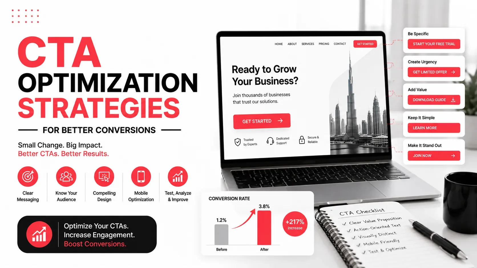
A call-to-action (CTA) is one of the most important elements on any webpage. Whether you want visitors to request a quote, sign up for a newsletter, book a consultation, or make a purchase, your CTA is what guides them toward that action. Even small improvements to CTA copy, placement, or design can have a measurable impact on conversion rates.
Many websites invest significant effort in attracting traffic but overlook the effectiveness of their CTAs. If visitors aren't sure what to do next or don't see enough value in taking action, they may leave without converting.
This guide explains how to optimize your CTAs using proven strategies that encourage more clicks, leads, and sales.
Quick Answer
CTA optimization involves improving the wording, design, placement, and timing of your calls-to-action to encourage more visitors to take the desired action. High-converting CTAs are clear, visually prominent, relevant to the page, and supported by persuasive content that builds confidence before asking users to act.
What Is a Call-to-Action (CTA)?
A call-to-action is any prompt that encourages visitors to perform a specific action.
Common examples include:
- Request a Quote
- Book a Consultation
- Start Free Trial
- Download the Guide
- Contact Our Team
- Get Started
CTAs can appear as:
- Buttons
- Text links
- Forms
- Banners
- Pop-ups
- Sticky navigation elements
Every important page on your website should have a CTA that aligns with the visitor's stage in the decision-making process.
Why CTA Optimization Matters
Even well-designed websites can struggle to generate leads if their CTAs aren't effective.
Optimized CTAs help:
- Increase click-through rates
- Improve lead generation
- Encourage product purchases
- Reduce user hesitation
- Create clearer user journeys
- Improve overall conversion performance
Rather than asking visitors to make decisions on their own, effective CTAs provide clear direction and reduce uncertainty.
Characteristics of a High-Converting CTA
Successful CTAs combine persuasive messaging with thoughtful design and placement.
The following elements contribute to stronger conversion rates.
CTA Element | Best Practice |
|---|---|
Button Text | Use clear, action-oriented language |
Placement | Position near decision points |
Visual Design | Make the CTA easy to notice |
Supporting Copy | Explain the benefit of clicking |
Mobile Experience | Ensure buttons are easy to tap |
Testing | Continuously test different variations |
Write Action-Oriented CTA Copy
The wording of your CTA has a direct impact on whether visitors click.
Generic button text often fails to communicate value.
Instead of:
- Submit
- Learn More
- Click Here
Use copy that clearly describes the benefit.
Examples include:
- Request Your Free Quote
- Schedule a Consultation
- Download the Complete Guide
- Start Your Free Trial
- Explore Our Services
Visitors should understand exactly what will happen after clicking.
Focus on Benefits Instead of Actions
The best CTAs communicate value rather than simply telling users what to do.
Compare these examples:
Less Effective
More Effective
The second CTA emphasizes the benefit visitors receive, making it more compelling.
Before writing any CTA, ask:
"Why should someone click this?"
If the answer isn't obvious, the CTA can likely be improved.
Position CTAs Near Decision Points
Even the best CTA won't perform well if visitors never see it.
Place CTAs where users naturally reach decision-making moments, such as:
- After explaining a service
- Following customer testimonials
- At the end of a pricing section
- After presenting key benefits
- Near frequently asked questions
Avoid forcing visitors to scroll back to the top of the page when they're ready to take action.
Use Visual Contrast
Your CTA should stand out from the rest of the page without appearing distracting.
Effective button design includes:
- Strong visual contrast
- Readable text
- Appropriate spacing
- Consistent styling
- Sufficient button size
The objective is to attract attention while maintaining a clean and professional appearance.
Support Every CTA With Context
Visitors are more likely to click when they understand why they should take action.
Instead of placing a button by itself, introduce it with supporting content that answers questions such as:
- What value will I receive?
- How long will it take?
- Is there any risk?
- Why should I act now?
For example, after explaining the benefits of improving website conversions, directing readers to conversion-focused web design provides a logical next step because it connects the information they've just learned with a relevant solution.
Match CTAs to User Intent
Not every visitor is ready to make a purchase immediately.
Someone reading an educational blog may prefer to:
- Download a guide
- Read another article
- Subscribe to updates
Whereas visitors on a pricing or service page may be ready to:
- Request a quote
- Book a consultation
- Contact your team
Aligning CTAs with user intent increases the likelihood of meaningful engagement.
Optimize CTAs for Mobile Users
A CTA that works well on desktop may not perform as effectively on mobile devices.
Review your CTAs to ensure they:
- Are large enough to tap comfortably
- Have enough spacing from nearby elements
- Load quickly
- Remain visible without excessive scrolling
- Use concise, readable text
Testing your CTAs on multiple screen sizes helps create a consistent experience across devices.
Limit Competing Calls-to-Action
Giving visitors too many choices can reduce conversions.
For example, displaying multiple buttons such as:
- Contact Us
- Learn More
- Download Brochure
- Subscribe
- Get a Quote
- Watch Demo
within the same section can make it harder for users to decide what to do.
Instead, identify the primary goal of each page and make one CTA the main focus. Secondary actions can still be available, but they shouldn't compete for attention.
Build Trust Before Asking for Action
Visitors are more likely to respond to a CTA when they already trust your business.
Support important CTAs with elements such as:
- Customer testimonials
- Client success stories
- Review ratings
- Industry certifications
- Frequently asked questions
Reducing uncertainty before presenting the CTA often leads to better conversion rates.
Test Different CTA Variations
There's no single CTA that works best for every audience.
Regular testing helps identify what encourages more visitors to take action.
Elements worth testing include:
- Button text
- Button size
- Placement
- Supporting copy
- Color contrast
- Page position
Test one variable at a time so you can accurately measure its impact on performance.
Common CTA Mistakes
Many websites reduce conversions by making avoidable CTA mistakes.
Mistake | Better Approach |
|---|---|
Generic button text | Use benefit-focused, action-oriented copy |
Too many CTAs on one page | Prioritize one primary action |
Weak visual contrast | Make important buttons easy to identify |
Asking for action too early | Build value before presenting the CTA |
Poor mobile usability | Design buttons for touch-friendly interaction |
Never testing performance | Continuously optimize using real data |
How to Measure CTA Performance
Improving CTAs requires ongoing measurement rather than assumptions.
Useful performance metrics include:
- Click-through rate
- Conversion rate
- Form submissions
- Lead generation
- Button interaction rate
- Scroll depth before CTA engagement
Reviewing these metrics helps identify which CTAs are encouraging action and which may need refinement.
If you notice that visitors consistently stop engaging before reaching important CTAs, reviewing How to Build a High-Converting Homepage can help identify broader user experience improvements that support better conversions.
Key Takeaways
- CTAs guide visitors toward meaningful actions.
- Action-oriented, benefit-focused copy generally performs better than generic wording.
- Position CTAs near natural decision points.
- Support CTAs with persuasive content and trust signals.
- Keep one primary CTA as the focus for each page.
- Optimize CTA design for mobile users.
- Test different variations regularly to improve conversion rates.
Turn More Clicks Into Meaningful Conversions
A successful CTA does more than attract clicks, it helps visitors move confidently to the next stage of their journey. When the message is clear, the value is obvious, and the action feels natural, users are far more likely to engage with your business.
Rather than relying on assumptions, continue testing and refining your CTAs based on user behavior and performance data. Small improvements in wording, placement, or design can produce meaningful gains over time.
Milaaj Brandset helps businesses create conversion-focused websites, persuasive content, and digital strategies that turn more website visitors into qualified leads.
FAQs
What is a CTA?
A call-to-action (CTA) is a prompt that encourages visitors to take a specific action, such as requesting a quote, booking a consultation, downloading a resource, or making a purchase.
Why is CTA optimization important?
Optimizing CTAs improves click-through rates, increases conversions, and creates a clearer path for visitors to achieve their goals on your website.
What makes a CTA effective?
An effective CTA uses clear, action-oriented language, communicates value, stands out visually, appears at the right moment, and aligns with the visitor's intent.
Should every page have a CTA?
Yes. Every important page should guide visitors toward an appropriate next step, although the type of CTA should match the purpose of the page.
How many CTAs should a page include?
Most pages should focus on one primary CTA while allowing supporting actions that don't compete for attention.
How often should CTAs be tested?
Review and test CTAs regularly. User behavior, design trends, and business goals change over time, so continuous optimization helps maintain strong conversion performance.
Ready to Elevate Your Brand?
Start Your Project Today