May 5, 2026
Mobile-First Website Design for UAE Users: Build Faster, Smarter, High-Converting Websites
Milaaj Editorial / Research Insights
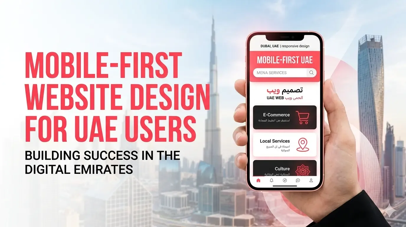
Mobile-first website design UAE businesses need today isn’t just about fitting content onto a smaller screen. It’s about rethinking how users interact, decide, and convert primarily through their phones.
In the UAE, mobile usage isn’t rising anymore. It has already taken over. Whether someone is searching for a service in Dubai, browsing products late at night, or comparing options during a commute, the first touchpoint is almost always mobile.
That shift changes everything.
Search engines like Google Search now evaluate your website based on its mobile version first. If your mobile experience is slow, cluttered, or difficult to use, your rankings, engagement, and conversions all take a hit.
So the real question is not “Do you have a mobile-friendly website?”
It is “Is your website built mobile-first from the ground up?”
What Mobile-First Design Really Means (Beyond the Buzzword)
Mobile-first design is often misunderstood.
It does not mean shrinking your desktop site to fit a phone. It means starting with mobile constraints and building upward.
In practical terms, that means:
- focusing only on essential content first
- designing for touch interactions, not clicks
- simplifying layouts before adding complexity
This approach forces clarity. And clarity is what drives conversions.
Why Mobile-First Design is Critical in the UAE Market
User behavior in the UAE is fast, intent-driven, and highly competitive.
People do not browse casually for long. They scan, compare, and act quickly.
What UAE Users Expect
- instant page load
- clean, easy-to-scan layout
- quick access to contact or purchase options
What Happens If You Do Not Deliver
- users leave within seconds
- trust drops immediately
- competitors win the click
A strong mobile experience does not just improve usability. It directly affects how your brand is perceived.
Mobile-First Design and SEO: The Direct Connection
There is no separation between UX and SEO anymore.
Search engines like Google Search use mobile-first indexing, meaning:
- your mobile version is your primary version
- performance metrics are measured on mobile
- user engagement signals influence rankings
This includes:
- mobile page speed
- Core Web Vitals
- usability and layout stability
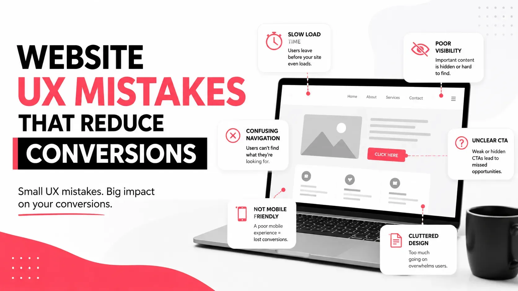
1. Design Navigation for Thumbs, Not Cursors
This is where many websites quietly fail.
On desktop, navigation is precise. On mobile, it is physical.
What Works
- large, tappable buttons
- bottom or reachable navigation zones
- simple menu structures
What Does Not Work
- tiny clickable elements
- crowded menus
- hidden navigation layers
A small improvement here can significantly improve user engagement.
2. Simplify Content Without Losing Meaning
Mobile screens force you to prioritize.
You do not have space for everything, so only the important things should remain.
How to Do It
- break content into short, scannable sections
- use headings that clearly communicate value
- remove unnecessary filler
If your content feels easier to read, users stay longer. When users stay longer, rankings improve.
3. Optimize Mobile Speed (This is Non-Negotiable)
Speed on mobile is critical.
Users in the UAE expect websites to load almost instantly. Even slight delays feel frustrating.
Focus On
- image compression
- script reduction
- lazy loading
Real Insight
Most websites do not lose users because of design.
They lose them because of speed.
If you want a deeper technical breakdown, this connects directly with strategies covered in the website speed optimization guide, especially around Core Web Vitals and mobile performance.
4. Use Responsive Design but Think Mobile First
Responsive design adapts layouts. Mobile-first design prioritizes them.
Mobile-First Approach
- design for the smallest screen first
- expand layout progressively
- avoid unnecessary desktop-first elements
This ensures your foundation is strong before scaling.
5. Make CTAs Impossible to Miss
On mobile, attention is limited. Your call to action must be obvious.
High-Converting Mobile CTAs
- Call Now
- WhatsApp Us
- Get a Free Quote
Placement Tips
- above the fold
- repeated naturally
- easy to tap
Clear CTAs reduce hesitation and guide users forward.
6. Reduce Friction in Every Interaction
Every extra step reduces conversions.
Every delay creates doubt.
Remove Friction By
- shortening forms
- enabling autofill
- minimizing steps
A smooth experience feels effortless and effortless experiences convert.
7. Design Forms That Users Actually Complete
Forms are where most websites lose potential leads.
Mobile Form Best Practices
- fewer fields
- large input areas
- clear labels
Simple Rule
If a form feels like work, users will not finish it.
8. Optimize Visual Content for Mobile Performance
Images and videos should enhance your site, not slow it down.
What to Do
- compress images
- use modern formats
- avoid heavy media on load
Visual content should load fast and support your message.
9. Improve Readability and Visual Comfort
Mobile users scan content quickly.
Make Content Easier to Consume
- use larger font sizes
- maintain spacing
- avoid dense text blocks
Good readability increases time on site and reduces bounce rate.
What Actually Works in 2026
Here is what matters now.
Not flashy design.
Not complex layouts.
Just clarity, speed, and usability.
What Works
- fast-loading pages
- simple navigation
- clear messaging
What Does Not Work
- cluttered interfaces
- slow performance
- overdesigned experiences
The best mobile websites feel effortless. That is the goal.
Common Mobile-First Mistakes Businesses Still Make
Even in 2026, many websites still get this wrong.
Common Issues
- designing for desktop first
- ignoring mobile speed
- using small, hard-to-click buttons
- overwhelming users with content
Fixing just these can significantly improve results.
How Mobile-First Design Drives Conversions
Mobile-first design is not just about usability. It is about results.
It directly impacts:
- lead generation
- sales conversions
- user engagement
A better experience makes it easier for users to trust you and take action.
Bringing It All Together
Mobile-first design works best when it is part of a larger system.
It connects with:
- UX design
- website speed
- SEO strategy
If you are planning to build or improve your website, this is where everything comes together. Many businesses start with design, but real results come when design, performance, and strategy align. This is exactly what we break down in our website development services Dubai guide.
Conclusion
Mobile-first website design UAE businesses need today is not a trend. It is the standard. Users expect fast, simple, and intuitive experiences on their phones, and anything less leads to lost opportunities.
From thumb-friendly navigation and fast loading speeds to clear CTAs and simplified content, every detail contributes to how users interact with your website.
When done right, mobile-first design improves usability, SEO rankings, engagement, and conversions.
If your current website feels slow, cluttered, or difficult to use on mobile, it is a sign that your foundation needs rethinking. Businesses that invest in better user experience often see immediate improvements in how users behave and how often they convert.
Milaaj Brandset helps businesses create mobile-first websites that are built for real users, real performance, and real growth.
FAQs
What is mobile-first website design?
It is designing websites starting from mobile devices before scaling to larger screens.
Why is mobile-first important in the UAE?
Because most users browse and interact with websites on mobile devices.
Does mobile design affect SEO?
Yes, mobile-first indexing makes it a key ranking factor.
How can I improve mobile UX?
Focus on speed, navigation, readability, and ease of use.
What is a good mobile load time?
Under 2–3 seconds for best performance.
How do CTAs impact mobile conversions?
They guide users toward action and improve conversion rates.
What are common mobile design mistakes?
Slow speed, cluttered layout, and poor navigation.


Ready to Elevate Your Brand?
Start Your Project Today