June 19, 2026
Why Responsive Web Design Matters in UAE
Milaaj Editorial / Research Insights

A website may look perfect on a desktop monitor but fail completely on a smartphone.
Buttons become difficult to tap, text becomes unreadable, images break layouts, and users leave within seconds.
For businesses in the UAE, this is a serious problem because most website traffic now comes from mobile devices. Whether someone is searching for a restaurant in Dubai Marina, comparing real estate projects, booking a service, or shopping online, there is a high chance they are using a smartphone.
Responsive web design is no longer a modern feature. It is a business necessity.
A responsive website automatically adapts to different screen sizes, ensuring users receive a consistent experience across mobile phones, tablets, laptops, and desktop computers.
This guide explains why responsive web design matters, how it affects SEO and conversions, and what UAE businesses should prioritize when building modern websites.
Quick Answer
Responsive web design ensures a website automatically adjusts to different screen sizes and devices.
Benefits include:
- Better user experience
- Higher search engine rankings
- Improved mobile usability
- Lower bounce rates
- Increased conversion rates
- Easier website management
- Stronger brand perception
For UAE businesses, responsive design is essential because mobile traffic dominates many industries and Google uses mobile-first indexing.
What Is Responsive Web Design?
Responsive web design is a development approach that allows a website to adapt dynamically to different devices and screen resolutions.
Instead of creating separate desktop and mobile websites, one responsive website serves all users.
Responsive Design Adapts To
Device Type | Screen Size |
|---|---|
Smartphones | Small screens |
Tablets | Medium screens |
Laptops | Large screens |
Desktop Monitors | Extra-large screens |
The goal is to provide an optimal user experience regardless of device.
Mobile Usage in the UAE Continues to Grow
The UAE is one of the most digitally connected markets in the world.
Consumers regularly use mobile devices for:
- Local searches
- Ecommerce purchases
- Service inquiries
- Social media engagement
- Online bookings
- Business research
Whether someone is searching for a web design agency in Dubai, comparing real estate developments, or booking a restaurant, there is a strong likelihood they are using a smartphone.
Businesses that fail to deliver a smooth mobile experience risk losing valuable opportunities to competitors with better websites.
Google Uses Mobile-First Indexing
Google primarily evaluates websites based on their mobile versions.
This process is known as mobile-first indexing.
In practical terms, Google looks at how your website performs on smartphones before determining rankings.
Responsive Design Helps With
- Mobile usability
- Crawlability
- User experience signals
- Page engagement
- Search visibility
Businesses that ignore mobile optimization risk losing both rankings and customers.
Responsive Design and SEO
Many business owners think SEO is only about keywords and backlinks.
In reality, user experience plays a significant role in modern search rankings.
How Responsive Design Supports SEO
SEO Factor | Impact |
|---|---|
Mobile usability | Positive ranking signal |
User engagement | Longer session durations |
Bounce rate reduction | Better user signals |
Faster navigation | Improved experience |
Mobile-first indexing | Better search visibility |
Responsive websites create stronger SEO foundations.
Businesses focused on improving both website performance and search visibility can also explore our SEO Services Dubai for technical SEO, mobile optimization, and organic growth strategies.
Better User Experience Leads to Better Results
Visitors expect websites to work smoothly.
A responsive design improves:
- Navigation
- Readability
- Accessibility
- Engagement
- Conversion opportunities
Poor Experience vs Responsive Experience
Poor Mobile Experience | Responsive Experience |
|---|---|
Tiny text | Easy-to-read content |
Broken layouts | Consistent design |
Difficult navigation | Simple menus |
Small buttons | Touch-friendly interactions |
Frustrating forms | Mobile-friendly forms |
Good UX often leads directly to higher conversion rates.
Responsive Design Improves Conversion Rates
Website traffic alone does not generate revenue.
Conversions happen when visitors can easily complete actions.
Examples include:
- Contacting a business
- Requesting a quote
- Booking a service
- Purchasing a product
- Filling out a form
Conversion Benefits of Responsive Design
Benefit | Business Impact |
|---|---|
Easier navigation | More inquiries |
Faster form completion | More leads |
Better readability | Increased engagement |
Mobile usability | Higher conversions |
Reducing friction throughout the user journey increases the likelihood of conversion.
Responsive Design Supports Faster Website Management
In the past, some organizations maintained separate desktop and mobile websites.
This often resulted in:
- Duplicate content
- Higher maintenance costs
- Inconsistent updates
- SEO challenges
Responsive design simplifies website management because businesses only need to maintain a single website.
Updates, content changes, and SEO improvements can be implemented more efficiently, reducing long-term operational costs.
Responsive Design Supports Brand Credibility
Users often judge a company's professionalism based on its website.
A poorly optimized website may create perceptions such as:
- Outdated business
- Lack of professionalism
- Poor attention to detail
A responsive website reinforces:
- Trust
- Credibility
- Professionalism
- Brand quality
First impressions matter.
Key Responsive Design Elements
Not all responsive websites are created equally.
Modern responsive design should include:
Essential Components
Element | Purpose |
|---|---|
Flexible layouts | Adapt to screens |
Responsive images | Load properly on devices |
Mobile-friendly navigation | Easier browsing |
Touch-friendly buttons | Better usability |
Optimized typography | Improved readability |
Fast loading pages | Better performance |
These elements work together to create a better user experience.
Common Responsive Design Mistakes
Many websites claim to be mobile-friendly while still creating poor user experiences.
Common issues include:
- Tiny text that is difficult to read
- Buttons that are too small to tap
- Slow-loading pages
- Oversized images
- Poor navigation structures
- Forms that are difficult to complete on mobile devices
Responsive design should focus on usability, not simply making a website fit onto a smaller screen.
Responsive Design vs Adaptive Design
Many people confuse responsive and adaptive design.
Responsive Design | Adaptive Design |
|---|---|
Flexible layouts | Multiple fixed layouts |
Adjusts continuously | Loads specific versions |
Easier maintenance | More complex management |
Preferred by Google | Less commonly used |
For most businesses, responsive design is the preferred solution.
How to Evaluate Your Current Website
If you're unsure whether your website provides a strong mobile experience, ask the following questions:
- Is the website easy to navigate on a smartphone?
- Are buttons easy to tap?
- Does content remain readable without zooming?
- Do forms work smoothly on mobile devices?
- Does the website load quickly?
- Can users find important information within a few seconds?
If the answer to several of these questions is no, your website may require responsive design improvements.
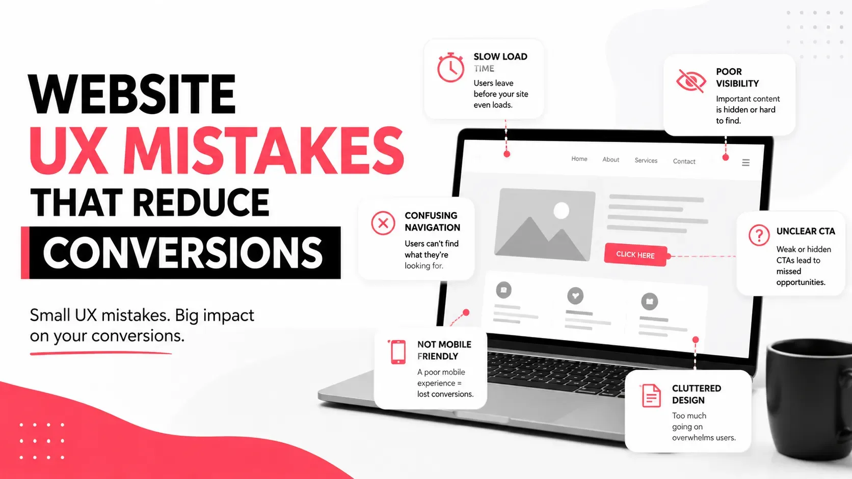
You may also find value in our Website UX Mistakes That Reduce Conversions blog which explores common usability issues that impact leads and sales.
Key Takeaways
- Responsive web design adapts websites to all screen sizes.
- Mobile traffic dominates many UAE industries.
- Google uses mobile-first indexing.
- Responsive design supports SEO and rankings.
- Better usability often improves conversion rates.
- One responsive website is easier to manage than separate versions.
- Mobile optimization influences trust and credibility.
- Responsive design is a critical component of modern website development.
Why Responsive Design Is Now a Business Requirement
Responsive design is no longer simply a web design trend.
It has become a fundamental requirement for businesses that want to compete online.
As mobile usage continues to grow across the UAE, companies that provide seamless experiences across all devices gain a significant advantage in search visibility, user engagement, and lead generation.
A responsive website helps ensure that every visitor receives a consistent, professional, and conversion-focused experience regardless of how they access your business online.
For organizations planning a website upgrade or redesign, responsive design should be one of the first priorities rather than an afterthought.
Milaaj Brandset helps businesses create responsive, SEO-friendly websites that support user experience, search performance, and long-term digital growth.
FAQs
What is responsive web design?
Responsive web design is an approach that allows websites to automatically adapt to different screen sizes and devices.
Why is responsive design important for SEO?
Google uses mobile-first indexing, meaning mobile usability directly affects search visibility and rankings.
Does responsive design improve conversions?
Yes. A better mobile experience reduces friction and helps users complete desired actions more easily.
What is the difference between responsive and adaptive design?
Responsive design uses flexible layouts that adjust automatically, while adaptive design serves fixed layouts for specific devices.
Is responsive design necessary for small businesses?
Yes. Small businesses often receive significant mobile traffic and need responsive websites to compete effectively.
How can I test if my website is responsive?
You can test across multiple devices, screen sizes, and browsers or use website auditing tools to identify usability issues.
Does responsive design affect website speed?
Responsive design can improve performance when implemented correctly with optimized images, layouts, and code.
How often should responsive design be reviewed?
Websites should be reviewed regularly as devices, screen sizes, and user expectations continue to evolve.


Ready to Elevate Your Brand?
Start Your Project Today